Saturday, June 22, 2013

Save-the-Dates for a Wedding


The artwork for this piece was hand-drawn in Illustrator and the frame was formatted in Photoshop. The use of the yellow gradient behind the frame allows for a colorful drop shadow that separates from the semi-opaque lace texture. These save-the-dates have been formatted to fit on a postcard, so it would be very easy to have a print shop print directly onto postcard paper. What I really like about this piece is how it is both elegant yet casual and flirty. It caters to both the feminine and masculine characteristics of the bride and groom. The color palette is complimentary, which makes the artwork pop.

(c) 2013 Angela Mannino

Wednesday, June 19, 2013

Forever the Sickest Kids T-Shirt Design


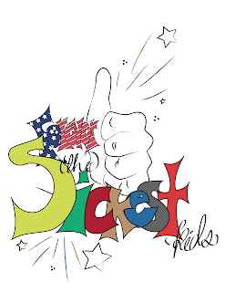
These designs are exactly the same aside from the obvious difference in background color. I'm not sure which one is better... Everything is hand-drawn in Illustrator. I sketched this out in my sketch pad about 3 hours ago, scanned it, and have been digitizing it ever since. The thumbs-up, lettering, streaks, calligraphy... all of it is my artwork. The only thing I used a tool for was the stars. Based off of this band's style (which, if you're looking for some new music, I recommend this band for pop-punk fans) and their new album (it is very patriotic themed), I made several clipping masks for the word "forever."

To make a clipping mask in Illustrator (like the one in "forever"), first you need to have a basic shape, like the "f." If you use a default font, simply right click on the letter, select "create outlines," and boom! You have a basic shape. Before you do anything else, copy and paste that same shape and set it off to the side. If you want a fill color, apply it to the first shape. Then, start filling the letter or shape in with whatever you want to put in it (stars, photos, stickers, etc.). It's okay if they run off the side of the shape; the clipping mask will fix that. After you've got it to where you want it to be, click on the shape you pasted. Take off any fill or stroke colors, bring it all the way to the front (right click, arrange, bring to front... or command + shift + ]), and place it directly over the original shape. Select all of it. Go to the top of the tool bar and find "object." Close to the bottom, you'll see "clipping mask." Highlight, select "make." Boom! You've got a clipping mask.

If you had a stroke on the original shape, it's going to look a little funky. Depending on what you have inside your shape, adding a stroke after you've made the clipping mask will apply it to all the shapes within the outside shape in addition to the outside shape. If you take a look at my word "forever," you'll see that the black stroke is on the outside of the "f" and around the stars on the inside. That is what will happen if you need a stroke color.

Trust me, the clipping mask is a tough tool to master. If you're having a problem, make sure that all the shapes are on the same layer. That caused me a problem that didn't get solved for half an hour. Perhaps your outlined shape is not all the way to the front. Make sure your outline shape is on top and everything else is arranged in the order you want it to appear. The stars in my letters needed to be above the letters themselves. The holes in the center of the "o" and the "e" needed to be on top of that as well.

If you have questions, I'd be happy to try and help. Maybe one day, Forever the Sickest Kids will see this and print it! That would be cool!

(c) 2013 Angela Mannino

Tuesday, June 18, 2013

Rachel Barrentine T-Shirt Designs


These were all designed with my friend's music in mind. These were early attempts at t-shirt designs. I experimented with the warp tool and the gradient tool as well as using tools in Illustrator to manipulate the text in the top two designs. I am most proud of the middle design on the 3rd image.

(c) 2012 Angela Mannino
(c) 2012 Rachel Barrentine (music)

MCC Sale T-Shirt Design


This design was made for the annual Mennonite Central Committee Relief Sale held at the Fresno Pacific University campus every April. The verse, Proverbs 1:5, was the motto for this year's sale. Placed in the shape of a cross, the text is formatted in different ways to elicit the message of the cross. The globe behind it is symbolic of the relief sale reaching across oceans and the sun peeking just over the horizon.

(c) 2013 Angela Mannino

Heaton House T-Shirt Design


I lived in the residence area at FPU known as Heaton One. I shared the house with five other girls, all of whom will be life-long friends. To commemorate our memorable year as a family, I designed a t-shirt for us to wear proudly and carry with us the memories, good and bad, because both build us up. Unfortunately, this shirt was never printed because we could not agree on a reasonable price, but the design is still one I am proud of. 

(c) 2013 Angela Mannino

Sunday, June 16, 2013

Full Throttle T-Shirt Design


(front)(back)


This design was requested by the woman who managed Camp Keola summer staff for the summer 2013. Their theme was "Full Throttle," so I got the sense that she needed something streamline but forceful, edgy but clean. The front of the shirt employs all those characteristics with the addition of a lot of color as requested by the client. The back of the shirt is much simpler, only mimicking the color and grunge.

This is another version that was not printed. I used the gradient tool to create a radial gradient with 4 colors. The font is unique and it almost vibrates when you look at it, especially the "throttle." This design was round one of proofing, and the client chose the top design.

(c) 2013 Angela Mannino

East Hall 4 T-shirt Design


                                            (front)                                                                                               (back)

This design was made for a resident living area at Fresno Pacific University. A group of about 20 freshmen girls lived in East Hall 4 for the first year. This was drawn in Illustrator using a grunge brush and the pen tool to create the 4-anchor. The anchor represents the verse which is printed on the back along with everyone's name.


(c) 2013 Angela Mannino

Constructivism

This image uses sharp shapes, reflecting the constructivist style of the early 20th century. This image was created by drawing an original art brush in Illustrator and turning it into a stroke. On the front, it was applied to a circle shape, then duplicated, enlarged periodi-cally and blended. On the back, it was duplicated and staggered. The white band on the front is a basic white rectangle with the opacity lowered to about 50%.

*Student Work. Spring 2013.*
*This image does not reflect the opinions or artistic intelligence of Blink-182 or any of its affiliates. The content used in this image is for the sole purpose of demonstrating the style of the art period and reflectant of punk-rock music. Song titles belong to the band.*

Art Nouveau

This image reflects the style of Eugène Grasset of the Art Nouveau period with organic color schemes and light, feathered textures. "Art Nouvea" literally means "new art," rising up in trend from 1890 to 1910. Grassat was a Swiss born illustrator and designer most famous for his oriental and medieval inspirations. His most common products included book covers, furniture, stained glass, and textiles. What is particularly monumental for Grassat is his union of three important elements: illustrations, format, and typography. In my design, I mimic Grassat's use of decorative designs that frame the subject as well as alternating sizes of type. Many of his pieces reflected that of a coloring book with thick contour lines that clearly marked the borders of the subject, which is also mimicked here.

*Student Work. Spring 2013."

Book Cover (Student Work)

This image employs the style of Koloman Moser who used a combination of mystical symbols with simplified two-dimensional space. Moser's fascination with geometry led to him leaning toward more flat shapes and simplicity. This resulted from an emphasis on geometric patterns and modular design construction in his time. Moser was considered to be a secession artist, specifically the Vienna Secession in 1897. This piece is modeled after Moser's Ver Sacrum magazine cover with inspiration from Ernest Hemingway's In Our Time.

*Student Work. Spring 2013.*